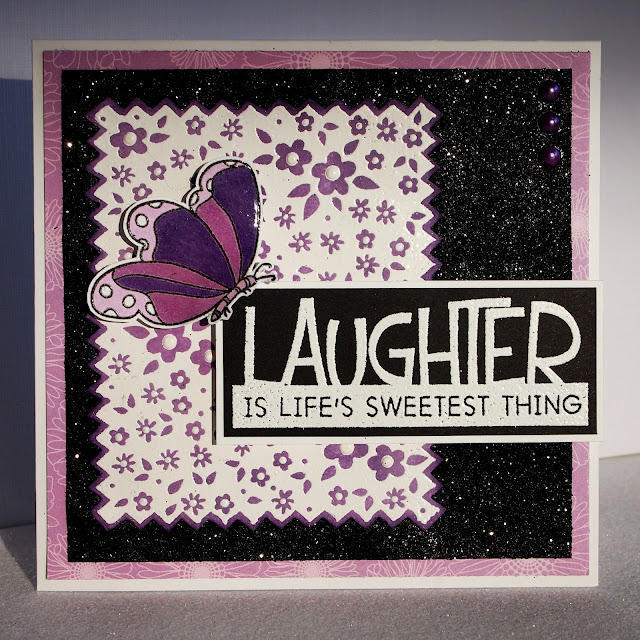
This week's Play Date Cafe colour challenge is a "splash" of lilac. I am sooo lovin' purple lately! Here is the beautiful inspiration photo from Sarah. You can check out the PDCC HERE.
Just a reminder about my blog candy HERE
This week's prize will be from our sponsor
So I thought I would try again.....This time I added way more then a "SPLASH" of lilac and SAME thing!!!! Ahhhhhhh
Even thought playing with my new technique of Copics on Velum would help me.....Nope!! oh well.
So I highly recommend you head on over to the other PDCC DT members...for they are sure to knock your socks off :)
Supplies for Laughter
Stamps: Hero Arts CG 247Edged Fabric with Flowers, CG276 Things for sentiment, and CG130 Butterflies.
Ink: Tim Holtz Distress ink and Copic markers.
Paper: PTI, and Bazzill
Misc: Glossy Accents, pearls, and Zing embossing powder.
Supplies for Find Joy
Stamps: Hero Arts CL495 Blossom Art, CG119 Flourish Background, and CG276 Things for sentiment.
Ink: Hero Arts, Tim Holtz, and Copics
Paper: Bazzill, PTI, and velum
Misc: brad, Spellbinders, and Zing embossing powder.
Thanks for stopping by to visit!!! I sure hope you have time to go play at the Play Date Cafe!!! I would LOVE to see what you come up with!!!!
Hugs,
TRace


21 comments:
Poor Trace - sounds like this was a stressful colour week for you!! You did a fabby job on both cards - you shouldn't have worried so much!! Hugs to you :)
So much loveliness all in one spot : ) Great job!
I love them both, Tracey! Beautiful mix of stamps on the first one and your flower on the second card looks so cool! I tried making 3 or 4 cards for the color challenge last week and didn't like any of them. . . .Purple will be much easier for me. . . .I hope!
I agree with Fee, your cards are great. I love that textured pattern you've created on that flower, so marble-y and gorgeous!
TRace, I have one of *those* weeks coming up next week, unless I can get something to work for me. I have already made two cards for next week's challenge and hate 'em both. So - I feel your pain.
Having said that, I think both your cards are sweet. I especially like the detailed closeup of the flower; it has so much detail in it that isn't readily visible at a distance.
Here's to keeping the mojo flowin'. :D
Absolutely perfect, TRace! You did such a great job for being a little stressed! Love all your embossing and glossy accents and glitter papers and... Well, just everything!
Can't see what's not to like Tracey...look pretty stunning and lovely to me! Great job once again...love how you put yourself out there with your boldness of colour.
Lilian
Two awesome cards...love the dots on the 2nd one and the sentiment on the first is just wonderful. I am such a lover of dots. Super details and great close-up of the pretty flower.
Love both your cards!!! The embossing is fabulous and the colors are gorgeous!!!
Ahh, Tracey, I WISH I had your problems! You're not happy with these cards, yet I think they are FABULOUS! I know what you mean, I have had that feeling before, but I really do love both cards! You've inspired me to play along again!
So fun, so whimsical, so purple-licious! Love these! And just so I can have the proper supplies when you come over...peanut or plain? hehhehe
Both cards are wonderful TRace! I adore the butterfly on the first and flowers are always my fave from the second card. Wonderful splashes of purple and super designs, Don't you love when inspiration strikes and takes over? Me, too!
These are lovely TRace! I always find colour splashes a real challenge. I keep having to say remind myself, 'it's a colour 'splash' but I ALWAYS want to add more colour. I think your creations are fab!
I think they are both wonderful cards - but then I adore purple!! I particularly like the one with the flower, so pretty!
And thank you for your kind comment on my "purple rose" card - this challenge was a joy to me :)
These are both lovely...remind me that spring is not far off!
LOOOOOOOOOOVE that you made two cards! They are both fabby--great use of just a splash:) I love that purple brad in the center of that flower--LUSH! LOVE IT!
very sweet cards, Tracey! love all the shades of purples you used and your designs are always fab! super cards, girl!
Love the effect you've got on the flower, it's gorgeous!
Beautiful and such a bold color combination, love both of these cards Tracey!
Wonderful cards, Tracey! I love love love LOVE how the Copics look on vellum, awesome!
what's up trace44.blogspot.com owner found your blog via yahoo but it was hard to find and I see you could have more visitors because there are not so many comments yet. I have found website which offer to dramatically increase traffic to your blog http://traffic-for-your-website.com they claim they managed to get close to 4000 visitors/day using their services you could also get lot more targeted traffic from search engines as you have now. I used their services and got significantly more visitors to my website. Hope this helps :) They offer most cost effective services to increase website traffic at this website http://traffic-for-your-website.com
To your success James
Post a Comment